Inroduction
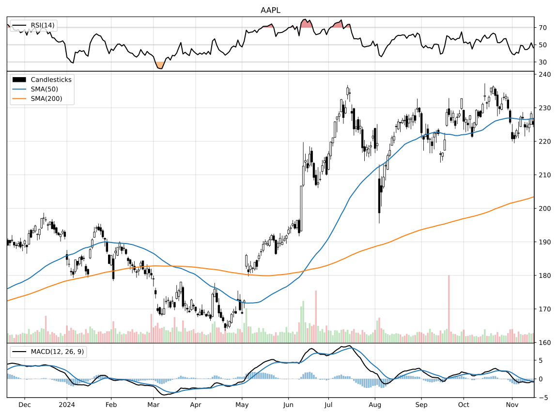
Create classic technical analysis stock charts in Python with minimal code. The library is built around matplotlib and supports both pandas and polars DataFrames. Charts are defined with a declarative interface, based on a set of drawing primitives like Candlesticks, Volume and technical indicators like SMA, EMA, RSI, ROC, MACD, etc.
Installation
pip install mplchart
Typical Usage
# Candlesticks chart with SMA, RSI and MACD indicators

import yfinance as yf

from mplchart.chart import Chart
from mplchart.primitives import Candlesticks, Volume, Pane, Line
from mplchart.indicators import SMA, RSI, MACD

ticker = 'AAPL'
prices = yf.Ticker(ticker).history('5y')

Chart(prices, title=ticker, max_bars=250, normalize=True).plot(
    Candlesticks(), Volume(), SMA(50), SMA(200),
    Pane("above", yticks=(30, 50, 70)),
    RSI(14) @ Line(overbought=70, oversold=30),
    Pane("below"),
    MACD(),
).show()
SMA and MACD use default rendering. The @ operator binds RSI(14) to a Line renderer to customize its display; Line(RSI(14), ...) is the equivalent constructor form.
Conventions
Prices data is expected to be a dataframe with columns open, high, low, close, volume in lower case and a datetime column named date or datetime (or a datetime index for pandas). If your data has column names in different capitalization (like data from yfinance) use the normalize option Chart(..., normalize=True) or call normalize_prices explicitly to normalize the dataframe.
Columns and deferred calculations
Keep chart data in prices. Pass column names, indicators, or expressions directly to plot() for default rendering; renderer primitives are optional. There are two ways to supply values:
- Existing columns:
chart.plot("sma-20")reads a column already inprices. Compute it beforehand with your own code or any indicator library. - Deferred calculations:
chart.plot(SMA(20))computes the indicator frompricesduring plotting. With polars data, use the factories inmplchart.expressionsinstead ofmplchart.indicators.
For example, with pandas data:
from mplchart.chart import Chart
from mplchart.samples import sample_prices
from mplchart.primitives import Candlesticks

prices = sample_prices(backend="pandas")
prices["sma-20"] = prices["close"].rolling(20).mean()

Chart(prices, max_bars=250).plot(
    Candlesticks(),
    "sma-20",
).show()
For deferred calculation, replace "sma-20" with SMA(20), importing SMA from mplchart.indicators. Both use default rendering: a line for a single column or moving average.
To customize the display, optionally use a renderer such as Line, Area, or Bars: Line("sma-20", color="red") styles an existing column, while Line(SMA(20), color="red") styles a deferred calculation.
SMA(20) @ Line(color="red") is an alternative to Line(SMA(20), color="red"); both defer calculation until plotting. Parenthesize composed expressions before binding, for example (EMA(20) - EMA(50)) @ Area() with polars expressions. Pandas expressions (pd.col(...) or .as_expr()) require constructor binding because pandas handles @ itself.